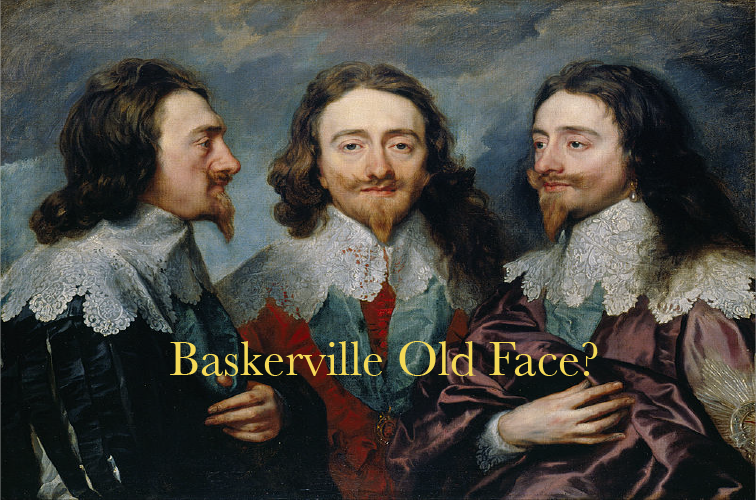
In every student’s life, there comes a time when she realizes Arial or Times New Roman just won’t cut it. This moment is a marker on the long road to growing up, not unlike the moment when you realize a used plastic water bottle is not always the most appropriate vessel for vodka, or that leggings and a flannel are not appropriate clothes for every occasion.
The first time I needed to use a more professional font, I scrolled through the list of fonts in Microsoft word and formed a question that haunts me to this day: who signed off on these names? To be fair, some font names have a clear relation to how the font actually looks. Most, however, have no apparent relation to typography at all:
1. Goudy Old Style
This one brings images of a high-end 19th century brothel to mind.
2. Apple
Steve Jobs is trying to send us a message from beyond the grave. He can only communicate using this font, or a series of generic iPhone ringtones.
3. Birch Std and Blackoak Std
I’m picturing dark squiggles that look like something between bits of tree bark and herpes sores.
(Yes, I realize “std” actually means “standard” in this context. But still.)
4. Haettenschweiler
Oktoberfest, anyone?
5. Mistral
At first I thought this was a misspelling of “minstrel.” Turns out, it’s a “cold and northwesterly wind that blows from southern France into the Gulf of Lion.” Also, a helicopter carrier ship. Either way, no relation to the alphabet.
6. Minion Pro
I don’t think I need to make the Despicable Me joke here.
Absurd as these font names are, they can’t compete with the names of free fonts. For those of you who have never ventured outside of Microsoft Word, these are available for download all over the internet. A trip to the land of free fonts will invariably lead to disturbing revelations about the nerdiness of our fellow man. Be warned: there are hundreds, literally hundreds, of Elvish fonts out there. Would Tolkien be proud? I’m not sure, but I digress. Below are some choice examples of bizarre – and 100% real – font epithets:
Many describe very specific activities that have nothing to do with letters or writing:
1. Lazing on a Sunny Afternoon
2. Chaos in Wisconsin
3. Vampire Raves
4. Margarita in August (there’s no way a font could live up to this name)
5. Jack and the Beanstalk
6. Frosting for Breakfast
7. Bleeding Cowboys
(Any one of the above would make an excellent band name.)
Some.. I can’t:
1. Parkinsonism
2. Crack Whore
3. Times New Romance
4. Chicken Butt (really?)
And my personal favorite of the day: Zephyr Jubilee
Some fonts, like “Papyrus” and “Palace Script” describe themselves so well they make me wonder if I’m just missing something about the majority of font names. Am I the only one who doesn’t know what “Spinwerad” means? Other times, I do see a meaning in a font moniker and wonder if it’s real or a symptom of my tendency to find Monty Python references in everything (see: “Flesh Wound”). Somehow, font names have become yet another source of is-there-something-I’m-missing anxiety. So, here’s hoping they confuse you as much as they confuse me.

