Abstract:
Ever wanted to dig deep into the nitty gritty details of an advertisement and see if it just falls into pieces? This project does just that with the google full google suite (docs, sheets, slides, and forms) and is going to tell you all about it. You’re in my playground now, kiddo.
Introduction:
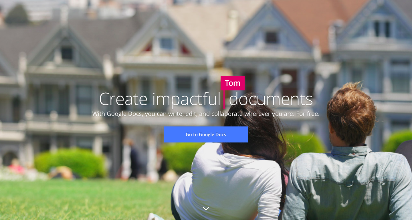
In case you haven’t made the mistake of going to google.com/docs/about instead of google.com/docs–here’s what the landing pages look like.
Docs

where faceless milktoast yuppies look at houses
Sheets

where faceless bikers all wearing the same helmet ride into the doom canyon
Slides

where a meditative child in pristine beekeeping attire stands in front of a slightly taller child with no face
Forms

where two hands lightly grasp a campfire treat. These two hands may or may not belong to the same person and you can convince yourself either way if you stare at it long enough. Also no faces.
These landing pages have an inoffensive little flag animation that resembles people typing into a google doc and replacing the central adjective. The question remains, however, what happens when we examine each name, adjective, and their respective frequencies?
Hypothesis:
I’ve honestly got no expectations for this.
Hopes:
Under strict scrutiny this seemingly-well constructed ad will wither and die. Or reveal some kind of easter egg.
Data:
I examined these four landing pages for about seven whole minutes and here’s what I found:
- Every page has a rotation of three flags that always appear in the same order: yellow to pink to blue and back to yellow again.
- A complete rotation lasts about 15 seconds, with 5 seconds per flag
- Some names re-appear while other names are one-hit wonders
- Reappearing names have consistent flag colors
- These names are all lame and white
- With the exception of Sage, which is pretentious and white
I then made a chart displaying how often each “person” appears and what adjective they type in:

Analysis:
Google’s ad campaign is at once completely haphazard and bizarrely repetitive. Words repeat but not often enough for it to seem purposeful. Characters repeat but with no consistency or reliability. It’s absolutely maddening.
From the data collected in the chart, however, I was able to divine the character of each “person” Google created:
Pam: Pam’s the one that does all the work for the group project. She’s everywhere you want her to be and everywhere you don’t want her to be, but you’ve got to admit that she’s got zeal. She’s got a son who’s looking at Northeastern and isn’t afraid to let you know. When men ask for Pam’s number she gives them her business card.
Tom: Tom’s the type to be mad that his flag color is pink and only knows two adjectives, apparently. His two favorite things are his La-z-boy chair and his fishing rod collection, but if you ask him in person he’ll say they are “Friday nights with the boys” and “making a difference.”
Kim: Kim think’s she’s hot shit when it comes to conflict resolution because she did debate team in high school but breaks down when her sandwich is stolen from the fridge. She’s the kind of person to ask “oh, how are you?” while walking away because you both know she doesn’t give damn about the answer.
Sage: Sage reads articles in the New Yorker and then tells you that he read an article in the New Yorker. He also signs all of his emails with “cheers” because he had a British roommate once.
Jake: Jake’s a simple man. He says there’s “nothing wrong with the office coffee” and things like “if it ain’t broke, don’t fix it.” Jake has the same shirt in four different colors and has never seen a macaroon in his life.
Brittany: Brittany may or may not have stolen Kim’s adjective and her sandwich from the fridge, but you’re not going to ask her about it because there’s a rumor flying around that she’s keyed someone’s car. Brittany’s also very form over function. That’s why she spelled her name like a goddamn maniac.
Conclusions:
My hope that this ad campaign would wither and die under further examination was met with mixed results. While on one hand there was consistency and repetition, on another hand the repetition itself seemed more lazy than intentional and kind of lame for a company worth $500 million.
While I was unable to find the great Google easter egg, I hope that in publishing this data someone may be able to catch something I have missed. Until then, Godspeed.
